Blend Swap
Easy Read - Theme
by Blend Swap
Last crawled date: 8 years, 5 months ago
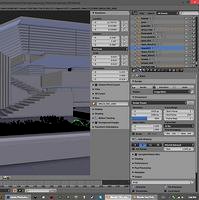
The standard Blender 2.78 Theme with slight changes for readability.Working long hours in Blender, i needed a UI that is as explicit as i can make it to not get tired. Colour should be used minimal so work gets distracted by the UI colours as little as possible. A goal was to build on the standard UI so it is easy to pick up and familiar. And the standard UI already is a good starting poin for a mid-gray UI in my opinion.panelbars are a bit lighter then panels (to tell them apart easier)activated options, sliders, tabs are blue (to see activated options in a glimpse)scrollbars pop-out slightly more (to see the position in a long list at a glance)very sharp blacks and whites are softened (to get less noise)Used on Blender v2.78Easy Read v02 - Good for technical work (very clear, more obtrusive)Easy Eyes v01 - Good for colouring and design work (unobtrusive, less clear)